Make your point
Wait, do you even have a point? Or are you just doing this because your boss asked you to prepare a report on testing status. Even then, you should make sure that every last one of your attendees is able to say in one sentence what you have been taking about when describing your speech to his collegue who missed it. It would be better if he said "John talked about lack of right equipment which affects our testing" than "Well, he was talking about bunch of stuff" or "He said our testing is bad".
I personally find great inspiration in watching TED talks, I find them fascinating. I will be going back to them quite a lot in this post, but there is one that I would give here as an exceptional example of making a good point. Once, you see it, you will never forget the point he makes, see for yourself. You may agree or disagree, but you will never ever be able to say, "I don't know what this guy was talking about".
Talk short, finish early
One thing I really like about the TED talks format is that they are short. Turns out, fifteen minutes are enough to communicate even the greatest of ideas to the point from which the audience can follow and expand it further using the almighty Internet, if it finds it worthy. Fitting into the tight frame makes you drop the inconsequential and focus, focus, focus on the very essence of your work. It also makes controlling the public attention much easier. So next time they tell you that you have only twenty minutes to speak, don't be mad, be thankful.
Even if you have time, it makes sense to prepare less material and finish early. People like that. No offense, but in most cases whatever you are saying up there, means less to those people than having a good hot cup of coffee over discussing the latest "Survivor", unless you are just handling them the Tablets, and even then they would prefer you do that quickly. You would not believe the gratitude people would feel for those extra ten minutes of their lives that you rewarded them with. Of course, running out of time is completely out of the question.
Use less slides
Once you have prepared the first draft of the presentation, you will most likely notice that some of your slides are better than others. Be it because you have found a really good picture to match your point or that you have produced a very convincing graph, you will distinguish those slides from other boring, bulleted, unreadable lists, we see way too often. One idea to handle it is to just drop, completely drop all but the best slides. Could this work?
Once again, in TED it works. If you watch enough presentations, and I strongly recommend that you do, you will see that some speakers only use four or five good slides through the entire talk. You see, once you manage to stop using the presentation as the kind of cheat sheet you use to memorize how your speech going, you will find out that the slides actually divert the attention of the audience from one important part of the presentation. You. The speaker. Unless of course, those slides really help you to make your point.
A picture is worth a thousand words
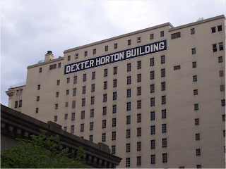
Yes, but a good picture used at the right time is priceless. Using high quality pictures to illustrate your ideas, can really boost your presentation. It is best of you took the picture yourself. Here is an example.

Amir took this picture himself and used it in a slide that urges developers to take ownership and proudly put their name on their code. "Look at this building" he said, "this guy must have been really proud of it. It may not be the prettiest building in the world, but at least you know who you should complain to".
Don't use low quality pics from the Internet, especially avoid beaten up photos and cliches. When using documentary photography, try to watch the context to avoid unwanted connotations.
I guess this is long enough for one post. Enjoy your presentations.
No comments:
Post a Comment